Custom Components with USWDS
Now that we’ve learned what design language is and how it helps us communicate the parts of a design, we’re going to use USWDS to create a new, custom, component.
By the end you should know how USWDS components are made so you can branch off of USWDS and create your own.
Below we have a mockup for a quote component. Although it may appear simple, we’re going to apply system level thinking and USWDS design language to extend USWDS to create it.
Searching For Existing Components
Section titled “Searching For Existing Components”First, let’s make sure we’re not duplicating effort by checking to see if USWDS already offers something similar.
-
Our first step is to check the official USWDS components page and see if a quote component (or something similar) doesn’t already exist.
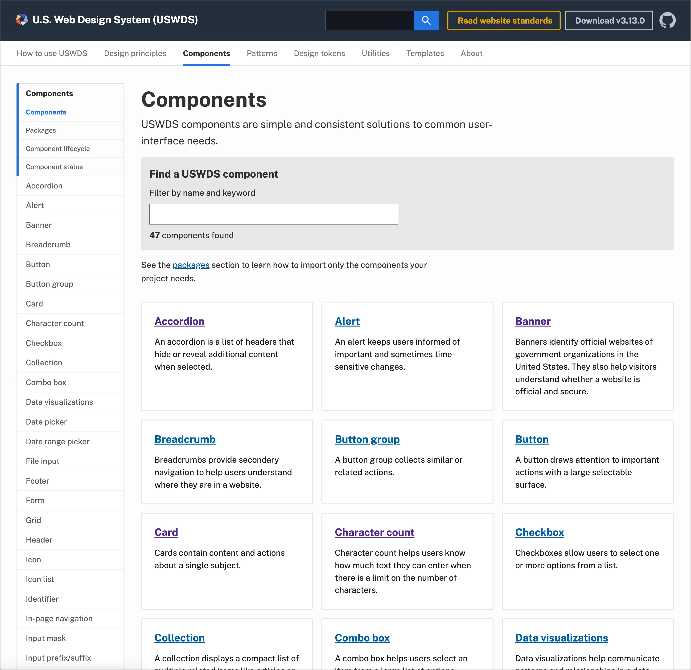
Nothing pops up immediately. Let’s continue searching.
-
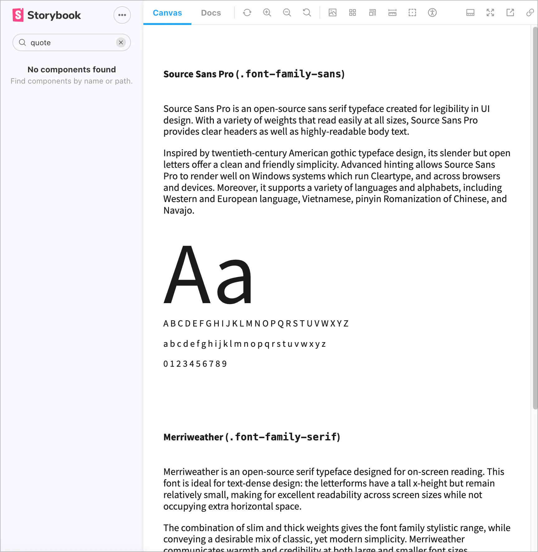
We know this is a typographic element, so lets check the typography component. On the left-hand sidenav find “Typography” or enter it in the “Find a USWDS component” search box.
-
There’s general guidance on the Typography page, but no actual quote mentioned. The left sidenav shows “Prose” listed. It’s related to typography, so let’s check that.
-
We see an example of prose (long form content), but no quote or blockquote. Just to triple check, we’ll visit the USWDS Component library.
Nothing there either, so we’re good to create our own!
Creating the Component
Section titled “Creating the Component”We’ve made sure this component doesn’t exist already and need to create one. Looking at our component again, let’s think about how we’ll build this.
It’s important to think about:
- Component content and fallbacks
- What if we don’t have a profile image?
- What if we don’t have an author or their title?
- Customizations
- How much configuration or theme settings do we need to create? Too few and users might have to add their own overrides. Too many and it’ll be too much work or confusing to configure.
- How many variants do we need?
With those considerations in mind, let’s start small and do our best to provide a “good” default that has:
- Top section for the quote with:
- A quote mark, either text or an icon.
- The quote text itself.
- An (optional) bottom section for the author information which includes:
- A profile picture or image.
- A full name.
- The person’s role or title.
No matter the tech stack of your design system, we’ll need to make sure we’re using accessible, semantic markup. We know there’s a native Blockquote element | MDN, so we’ll use that as our foundation.
Our biggest resources in applying the design language will be:
- The USWDS Design Tokens page to quickly reference the tokens we need.
- The Settings page to make sure we’re following existing component patterns. Basically, which tokens are currently used for existing components.
Following these guidelines, we’ll have a component that looks and feels like a USWDS component. Plus, we’ll be able to contribute it back easily without too much re-work.
-
In the demo repo, make sure the component library is running [
npm run lib] and go to http://localhost:6060/. Open the quote component that’s listed in the sidebar. -
In your browser, go to the Default Quote in Storybook. This is where we’ll see the component as we develop.
-
In your code editor, open
quote.html.twig. Right now its pretty bare bones and is based off of the MDN example.<!-- quote.html.twig --><div><blockquote><p>Transforming Government Services with Digital and Human-Centered Solutions</p></blockquote><p><img src="/assets/quote-placeholder.svg" alt="" /><span>Jane Smith</span><span>Creative Director</span></p></div> -
We’ll start with our structure. We’ll be using Block Element Modifier classes, just like USWDS. This is Drupal Govcon, so we’ll use
dgas our prefix.Let’s add our top-level component class,
dg-quote.quote.html.twig <div><div class="dg-quote"><blockquote><p>Transforming Government Services with Digital and Human-Centered Solutions</p></blockquote><p><img src="/assets/quote-placeholder.svg" alt="" /><span>Jane Smith</span><span>Creative Director</span></p></div> -
Next, let’s add classes for the top sections. We’re not adding classes to every element. You should take a minimal approach first to avoid redundant or unnecessary boilerplate.
Let’s split the top and bottom sections. Typically, USWDS components are broken out like semantic layout elements. You can see an example in the USA Card component’s use of
header, body, footer.We’ll take a similar approach to this component by adding a body class [
dg-quote__body] to the blockquote element. Body makes sense, because it’s the most important part of the component. Plus, it gives us the opportunity to a header in the future.quote.html.twig <div class="dg-quote"><blockquote><blockquote class="dg-quote__body"><p>Transforming Government Services with Digital and Human-Centered Solutions</p></blockquote><p><img src="/assets/quote-placeholder.svg" alt="" /><span>Jane Smith</span><span>Creative Director</span></p></div> -
For the bottom section, we have a paragraph, but not everything inside fits semantically. For example, the image inside the paragraph.
For now, let’s convert it to a generic
divand update once we test in a screen reader, like VoiceOver.We’ll also add a class. We could either use
footerormeta(for metadata). In this case, we’ll start with a generic approach (footer) and update as we iterate and test.quote.html.twig <div class="dg-quote"><blockquote class="dg-quote__body"><p>Transforming Government Services with Digital and Human-Centered Solutions</p></blockquote><p><div class="dg-quote__footer"><img src="/assets/quote-placeholder.svg" alt="" /><span>Jane Smith</span><div>Jane Smith</div><span>Creative Director</span><div>Creative Director</div></p></div></div> -
We’ll need the image and text to be side-by-side. The Gov Banner has an example of this when you expand it.
We could:
- Write our own custom CSS:
- We don’t know how much CSS we’ll need.
- We’ll have to test it extensively at different screen sizes.
- It’s already similar to an existing pattern, so custom CSS could cause confusion.
- Plus, we’ll be on the hook for maintaining it forever.
- Use the grid component by including
usa-layout-grid. This is a heavy CSS file though, because it compiles responsive classes too, so avoid unless you’ll be doing a lot of custom layouts. - Just use media block, like in USA Banner. The downside is our markup might not be as clean, but this seems like the best start.
We’ll start with
media-blockand test before launch if and how it impacts performance.We’ll also add our BEM component classes to the child elements.
quote.html.twig <div class="dg-quote"><blockquote class="dg-quote__body"><p>Transforming Government Services with Digital and Human-Centered Solutions</p></blockquote><p><div class="dg-quote__footer"><div class="dg-quote__author usa-media-block"><img src="/assets/quote-placeholder.svg" alt="" class="media-block__img dg-quote__author-image" /><div class="media-block__body"><div class="dg-quote__author-title">Jane Smith</div><div class="dg-quote__author-subtitle">Creative Director</div></div></div></p></div></div>With the main structure set, let’s start adding some basic styles and see how far we can get with the current iteration.
Final Markup
Your markup should look like this:
<div class="dg-quote"><blockquote class="dg-quote__body"><p>Transforming Government Services with Digital and Human-Centered Solutions</p></blockquote><div class="dg-quote__footer"><div class="dg-quote__author usa-media-block"><img src="/assets/quote-placeholder.svg" alt="" class="media-block__img" /><div class="dg-quote__author-title">Jane Smith</div><div class="dg-quote__author-subtitle">Creative Director</div></div></div></div> - Write our own custom CSS:
-
Before we add basic styles, resize your browser to
320pxor enable the mobile view in Storybook. It should be a square icon with two more lines to the top right of it. -
Go to the
_quote.scssSCSS partial. We’ll definitely need USWDS tokens, so lets add that first._quote.scss @use "uswds-core" as *;// …You can test and make sure it works by using a token in the quote body.
_quote.scss @use "uswds-core" as *;.dg-quote {background-color: color("gray-20");} -
Next, lets add the component to our
index.scssso we can see changes.storybook/packages/index.scss @forward "uswds-theme";@forward "usa-accordion";@forward "usa-banner";@forward "usa-button";@forward "usa-skipnav";@forward "usa-header";@forward "usa-hero";@forward "usa-section";@forward "usa-footer";@forward "usa-identifier";@forward "uswds-global";@forward "uswds-typography";@forward "components/quote/quote";You should see a gray background on the component.
-
In this step, we’ll start adding tokens.
First we’ll update our gray to use the theme base color.
You can see how other components set radius in the USWDS Settings page. It’s a
unit, so we can click on theunitslink and see all available unit token values. Let’s start with a basic unit of1.We’ll also add some inner padding. We know this is thicker, so we’ll double it and use a unit of
2._quote.scss .dg-quote {background-color: color("gray-20");background-color: color("base");border-radius: units(1);padding: units(2);} -
Next, let’s add some typography styles. We know the quote itself is bigger than the other text elements.
Checking the font size token page we see we have theme tokens available. They’re set from
3xsto3xland we can use these names to easily communicate with others on our team.The table on the size token docs show the function expects a family and size to be specified.
We’ll also remove the margin. For consistency, and to avoid any future confusion we’ll stick to units too.
_quote.scss // ….dg-quote__body {// …font-size: size("body", "md");margin: units(0);// …} -
Before we move on take a look at the CSS for the quote marks. We have them as pseudoelements in CSS.
We don’t want users to manually type them and we might not want them to be read by screen readers.
- What are the tradeoffs?
- Will look off if custom font has weird looking quotes.
- It’s not easy for user to change to some other quote style, like outline quotes or some other aesthetic.
- What’s the benefit to the user?
- Quotes are included with font, so no additional download.
- Using icons requires more markup, which increases maintenance, the burden to the user and more chance for risk (we want it to be easy to implement).
- The icons change color along with the font, so it’ll stay more or less in sync with little to no effort.
- What are the tradeoffs?
-
The quotes are pretty big, so try
xlfor the quotes._quote.scss // ….dg-quote__body {font-size: size("body", "md");&::before,&::after {content: "";display: block;font-size: size("body", "xl");}} -
Next, lets use tokens for the border and spacing on the footer. The color tokens page has three separate tokens listed: theme, state, and system.
_quote.scss // ….dg-quote__footer {border-top: 1px solid color("base-light");border-block-start: 1px solid color("base-light");padding-block-start: units(1);} -
Finally lets adjust the author information.
_quote.scss // ….dg-quote__author {align-items: center;column-gap: units(2);}Styles so far
Your styles should look like this:
_quote.scss @use "uswds-core" as *;.dg-quote {background-color: color("gray-20");border-radius: units(1);padding: units(2);}.dg-quote__body {--left-quote: "\201C";--right-quote: "\201D";font-size: size("body", "md");&::before,&::after {content: "";display: block;font-size: size("body", "xl");}&::before {content: var(--left-quote);}&::after {content: var(--right-quote);}}.dg-quote__footer {border-top: 1px solid color("base-light");border-block-start: 1px solid color("base-light");padding-block-start: units(1);}.dg-quote__author {align-items: center;column-gap: units(2);} -
Now that we have our mobile styles more or less done, let’s move up to tablet.
Remember, the spacing units page had sizes like
tablet, tablet-lg, desktop, etc.It tells us the pixel values, but for breakpoints the settings page or the layout grid utilities shows which breakpoints are available by default.There’s a
tabletbreakpoint at640px, so let’s start with that.USWDS also gives us media query mixins [
at-media(units)] so we can style according to USWDS breakpoints. You can see them on the Spacing units page.By default, the breakpoints are mobile-first using
min-width. We’ll go back to the start of the component, thedg-quoteclass..dg-quote {background-color: color("gray-20");border-radius: units(1);padding: units(2);@include at-media("tablet") {padding: units(3) units(6);}} -
Then we’ll work our way down to the quote itself and bump up the font size. Let’s jump up two levels from
mdtoxland see how it looks.We also have more room, so lets add some bottom padding to the quote.
.dg-quote__body {font-size: size("body", "md");margin: units(0);@include at-media("tablet") {font-size: size("body", "xl");padding-block-end: units(2);} -
Next, lets adjust our quote footer by increasing the font size and spacing.
.dg-quote__footer {border-top: 1px solid color("base-light");border-block-start: 1px solid color("base-light");padding-block-start: units(1);@include at-media("tablet") {font-size: size("body", "md");padding-block-start: units(2);}}Our component is looking pretty good. Feel free to add any additional touches.
Final stylesheet
Your styles should look like this:
_quote.scss @use "uswds-core" as *;.dg-quote {background-color: color("base");border-radius: units(1);padding: units(2);@include at-media("tablet") {padding: units(3) units(6);}}.dg-quote__body {--left-quote: "\201C";--right-quote: "\201D";display: grid;grid-template-columns: 1ch 3fr 1ch;text-align: center;font-size: size("body", "md");@include at-media("tablet") {font-size: size("body", "xl");padding-block-end: units(2);}&::before,&::after {content: "";display: block;font-size: size("body", "xl");width: 1ch;}&::before {content: var(--left-quote);}&::after {content: var(--right-quote);align-self: end;}}.dg-quote__footer {border-top: 1px solid color("base-light");border-block-start: 1px solid color("base-light");padding-block-start: units(1);@include at-media("tablet") {font-size: size("body", "md");padding-block-start: units(2);}}.dg-quote__author {align-items: center;column-gap: units(2);}